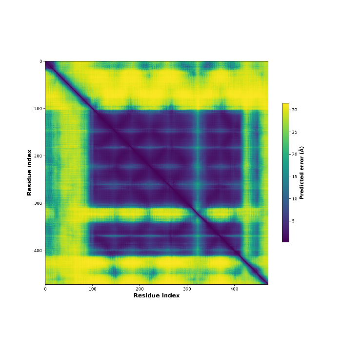
PAE Plot
ranked_0_PAE.png
This output plot visualizes the Predicted Aligned Error (PAE) for the top-ranked model (ranked_0.pdb).
Each color at position (x, y) indicates the expected position error at residue x, when the predicted and true structures are aligned on residue y.
The color scale indicates expected distance error in angstroms. Purple is ‘good’ (represents low error), whereas yellow is ‘bad’ (represents high error).
For example, the CB1 protein is a 7-transmembrane domain GPCR with less-structured tails on both termini, which appear as regions of higher predicted error.
Source: Arnold, M. J. (2021) AlphaPickle doi.org/10.5281/zenodo.5708709
More Information(see “Predicting aligned error tutorial” section)