Visualize PCA Results
You can examine and visualize PCA results in several different ways.
# Show the top genes contributing to the first 5 PCs
print(pbmc[["pca"]], dims = 1:5, nFeatures = 5)
Output:
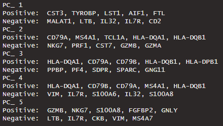
Genes that contribute to each PC are either positively or negatively correlated.
These values are called the loadings, and they describe how much each variable contributes to a particular principal component. Large loadings (positive or negative) indicate that a particular variable has a strong relationship to a particular principal component. The sign of a loading indicates whether a variable and a principal component are positively or negatively correlated.
Read more: http://strata.uga.edu/8370/lecturenotes/principalComponents.html
Gene Loadings
# Visualize gene loadings for PC1 and PC2
VizDimLoadings(pbmc, dims = 1:2, reduction = "pca") # dims = 1:2 refers to PC1 and PC2
Output:

PCA Space
# Plot cells in PCA space
DimPlot(pbmc, reduction = "pca")
Output:
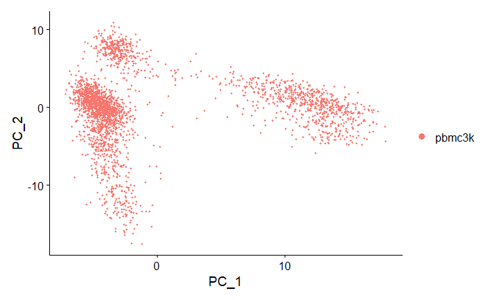
Note that the cells form distinct clusters in PC1vPC2 dimensional space.
PCA Heatmap
# PCA heatmap of first 15 PCs
DimHeatMap(pbmc, dims = 1:15, cells = 500, balanced = TRUE)
Output:
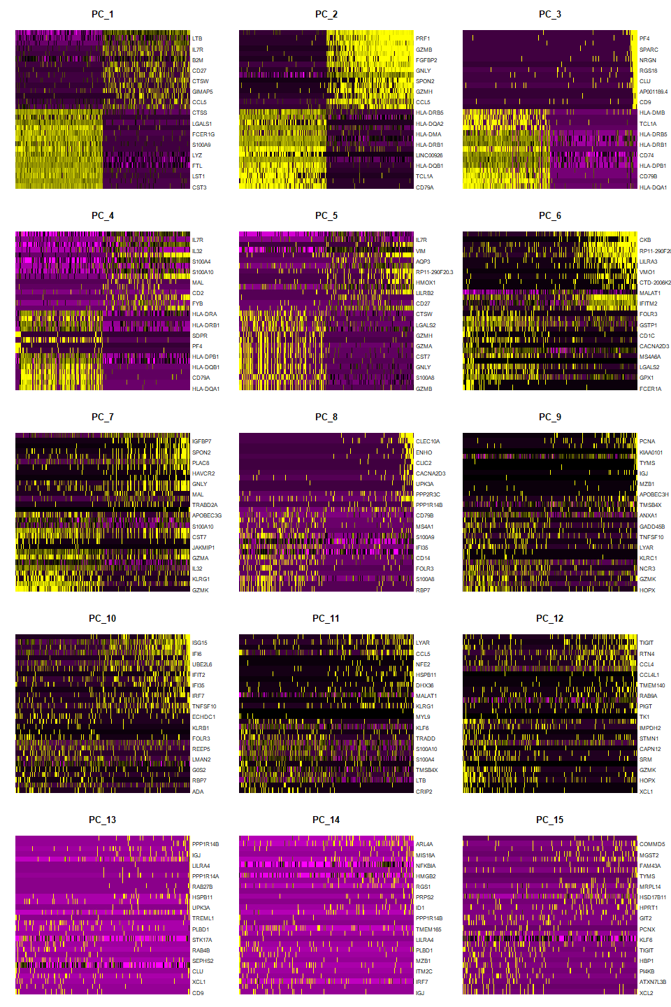
Interpretation: earlier PCs have greater variation (brighter yellow, darker purple) while later PCs are more homogenous, which indicates that the later PCs do not explain much of the variance in the dataset.
You can see which genes have positive versus negative loadings for each PC.
Setting balanced = TRUE plots an equal number of genes with both positive and negative PC scores (loadings).