Visualize Expression Across Clusters
Violin Plots
We use violin plots to visualize gene expression across clusters (x-axis).
VlnPlot(pbmc, features = c("MS4A1", "CD79A"))

# You can plot raw counts as well.
VlnPlot(pbmc, features = c("NKG7", "PF4"), slot = "counts", log = TRUE)
Outputs:
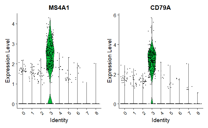
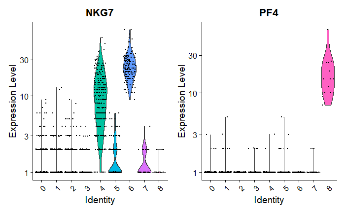
Observations:
Cluster 3 is heavily expressing MS4A1 & CD79.
Cluster 8 is heavily expressing PF4.
NKG7 is mostly expressed by Clusters 4 & 6.
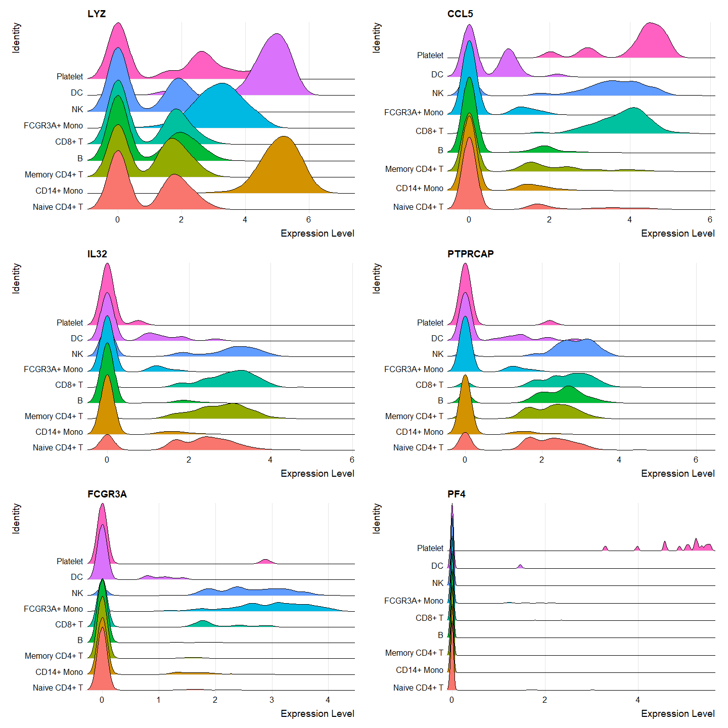
Ridge Plots
Ridge plots show the expression distribution by cluster.
# Make a list of features (genes) we'd like to view
features <- c("LYZ", "CCL5", "IL32", "PTPRCAP", "FCGR3A" "PF4")

# Ridge plots - from ggridges
# Visualize single cell expression distributions in each cluster
RidgePlot(pbmc, features = features, ncol = 2)
Output:
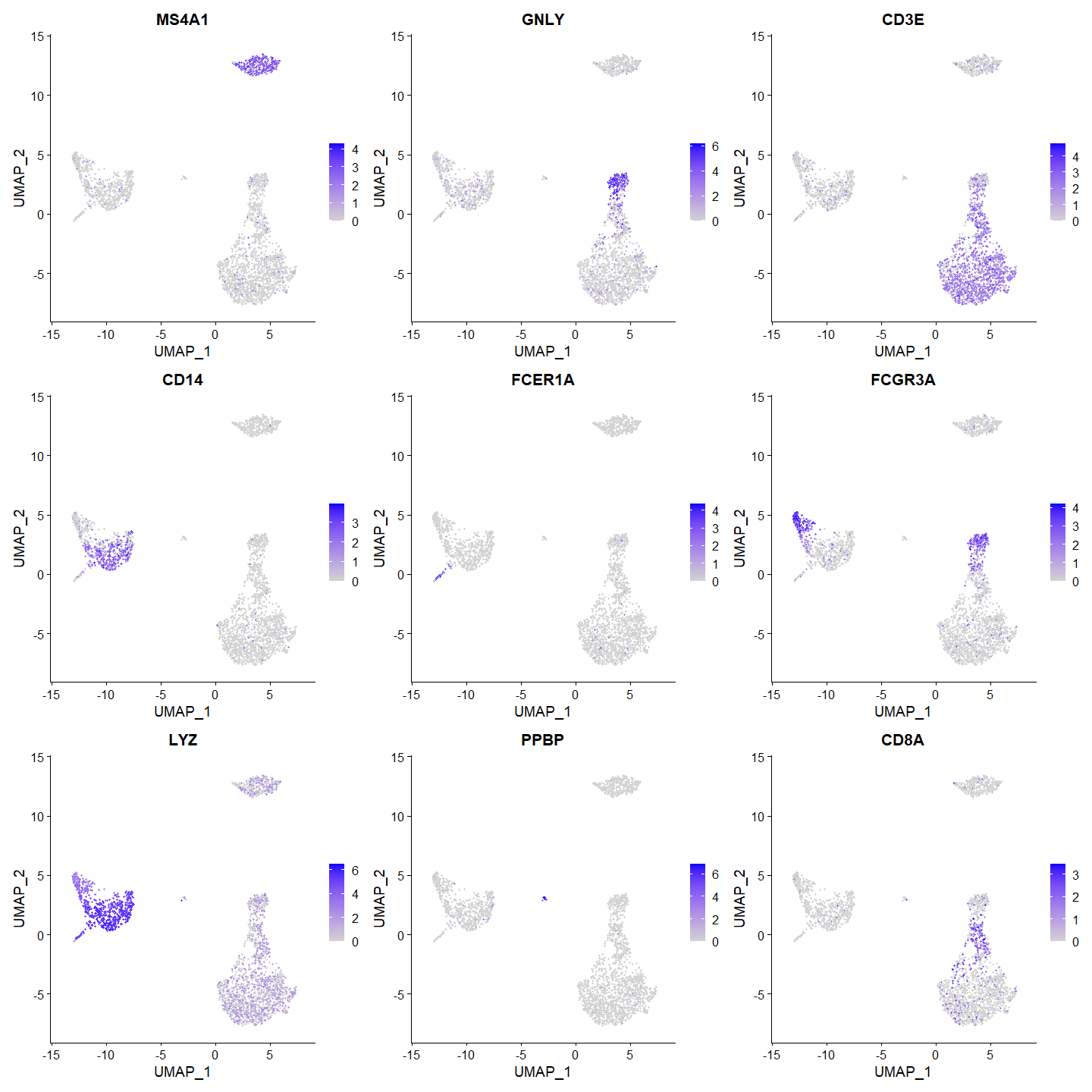
Feature Plots
Feature plots overlay gene expression on the UMAP embedding.
FeaturePlot(pbmc, features = c("MS4A1", "GNLY", "CD3E", "CD14", "FCER1A", "FCGR3A", "LYZ", "PPBP", "CD8A"))
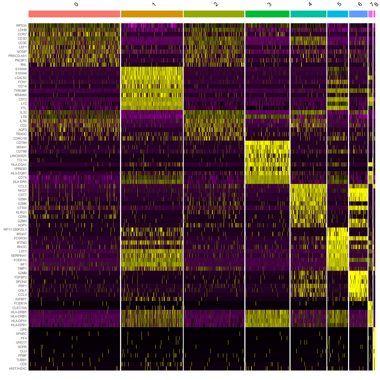
Heatmaps
DoHeatmap() generates an expression heatmap for given cells and features.
In this case, we are plotting the top 20 markers (or all markers if less than 20) for each cluster.
pbmc.markers %>%
    group_by(cluster) %>%
    top_n(n = 10, wt = avg_log2FC) -> top10
DoHeatmap(pbmc, features = top10$gene) + NoLegend()
Output: